A simple UI hack to improve Onboarding UX [OCD]


Messenger ui built using this free sketch resource
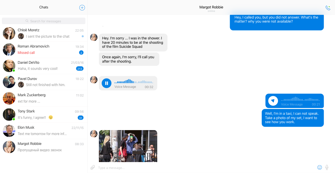
UI Mockups and sketches assume that user data is already present. For example, the mockup below assumes that the user will have contacts to chat with, notifications and even chat threads.
But this is never the case when a user signs up. In the beginning, there is no data, so an empty contacts column and an empty chat window.
Shiny UI design makes it easy to consume information and does not focus on how to create that information.
I learned this the hard way when I soaked as much of Dribbble I could to design a dashboard for a b2b application. It looked great on Sketch, but our customers weren’t able to find their way through.
Bad UX increases on-boarding and support cost, directly affecting revenue. It also feels bad to watch a user struggling to consume your pixel perfect design. Reminds you that you failed.
Existing Solutions
Upfront Presentation
One solution was to have an upfront on-boarding using slides like interface. This seems to be the standard for mobile apps.
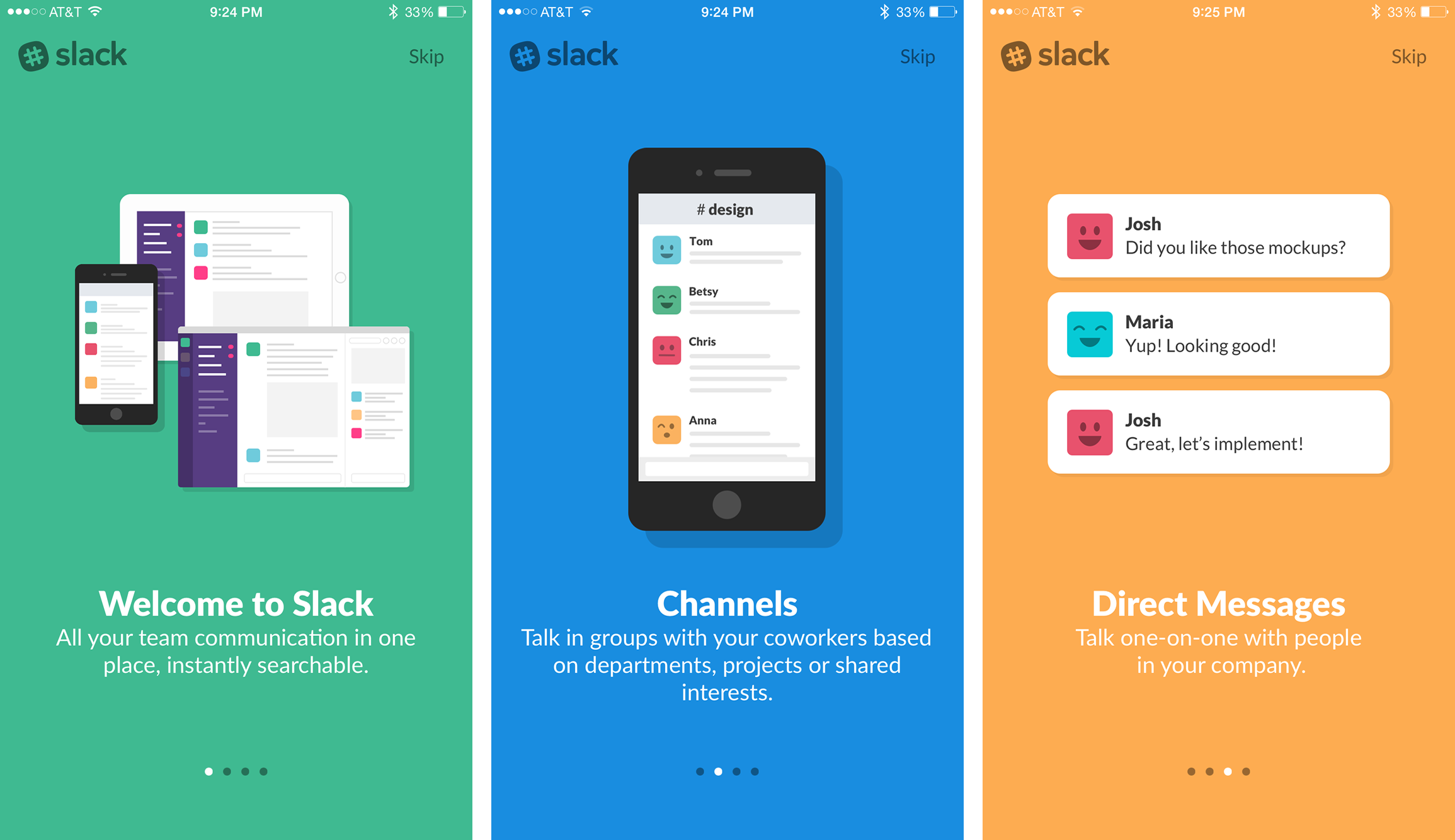 Slack’s slide-based on-boarding UX
The problem with slides approach is the lack of context. You can convey only so much on the slides (how much the user retains is a different question).
It’s great for giving an overview of the product, but not very helpful in explaining how the product works. It was irrelevant for my use case, as the complexity of the product could not be boiled down to a few slides.
Tooltip based steps
There was also a tooltip based solution that walks the user through specific steps. This option is more popular with web apps. There are many good javascript libraries to help you build these flows.
 Tooltip based on-boarding demo for introjs.com/
As far as a tooltip based solution goes, I found them annoying and almost always clicked “skip tutorial”. Though big companies like Canva use tooltip based on-boarding. A product called AppCues lets you design these tooltips without code, neat.
Information Beacon/Hotspot
There also exists a beacon style approach, where commonly misunderstood features are labeled with glowing beacons, which provide relevant information when (if) needed.
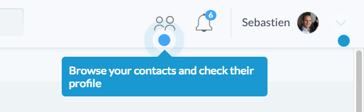 Beacon Styled Context
This is the most unobtrusive way. Unlike tooltip that shoves a 17 step tutorial down your throat and vanishes when you actually need it, this hotspot based approach provides info when you are ready.
It’s worth mentioning that Slack uses all of the 3 forms. No wonder their users stick. Which also somehow hints to the fact that retention is directly proportional to ease of on-boarding.
OCD aka Onboarding centric design
I like naming things. Names help materialize ideas in the mind. So let’s call this Onboarding centric design.
I wanted a solution which :
- Was relevant to the context
- Was not annoying (nobody likes to take 17 steps to learn how a feature works)
- Is unobtrusive (like the beacons)
- Is easy to consume (tooltips are not easy to consume)
Outcome
I simply started designing states. The chat design you saw while you started reading this article can be designed with three states.
State 1: No contacts are present
State 2: Contacts present, but no chats
State 3: Both chats and contacts are present
The goal of each state is to progress the user to the next state. When the user has progressed to state 3, she is successfully on-boarded. Considering the chat mockup, the goal for each state are as follows :
Goal of State 1: Prime user to add a contact
The mockup below has just one call to action, the blue plus button that lets the user add a new contact. The graphics and the text both prime the user to take that action.
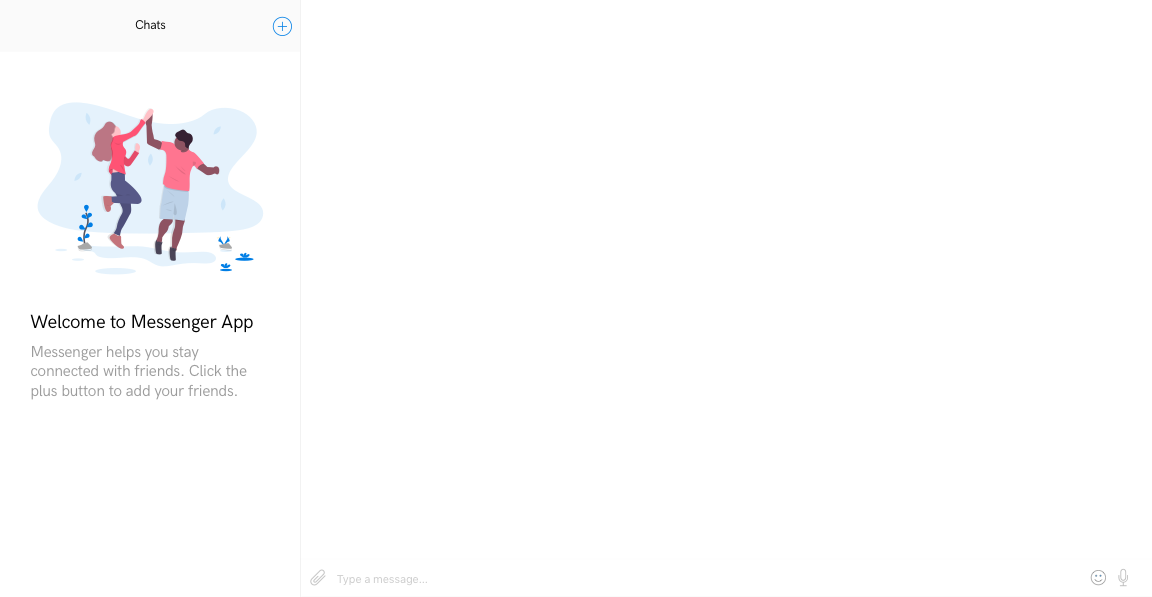 State 1 — Prime the user to add contacts (illustration by undraw.co)
Once a contact has been added, we can start the second goal.
Goal of State 2: Prime user to start a chat
The mockup below shows has a graphical primer to start a chat. It explicitly outlines the features available. Again, there is only one thing you can do now, i.e. send a message. You can also make a call in this UI, but both these actions serve the same purpose. They take your user to step 3.
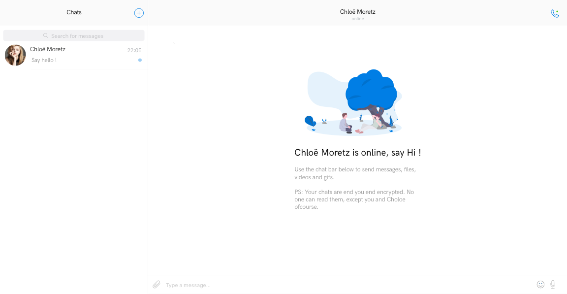 State 2 — Contact added, prime to start a chat
Goal of State 3: None, the user is on-boarded — all cues should vanish
And finally, when your user has repeated the process a few times, her UI will start looking the way we originally intended.
 State 3 — The user is successfully on boarded
Benefits of this approach
- Compared to slides approach in step 1, Onboarding Centric Design (OCD) presents the content in chunks. The information is available at point of decision making.
- This approach can be used on both mobile and desktop devices. This UI is simple, but in case of a complex UI, you can use OCD with hotspots to elevate CTAs.
- This approach improves your UX in the first place, by forcing you to think in terms of the user’s journey.
- If you happen to write your frontends using React, this approach fits in neatly with its component architecture.
So as a rule of thumb :
Design mockups for states.
Each state has one goal — progress to next state.
The last state is when your user is on-boarded